

Product: An app for The Bay Art Museum, a public art museum that's based in San Francisco.
Role: UX Designer and Researcher.
Responsibilities: User research,User interviews,wireframing, prototyping
and user testing.
and user testing.
Duration: September 2024-January 2025
The Problem: After conducting interviews with current art museum app users, several things stood out to me. The most common pain points were that ticket purchasing was not straightforward on most of those apps, upcoming exhibitions weren't easy to find and that often there was a lack of accessbility in the designs.
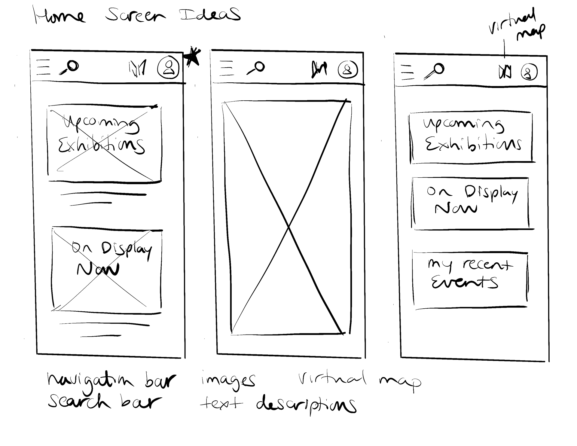
The Goal: The goal based on my user interviews was to build this app with a simple ticket purchase flow, feature the upcoming and featured exhibitions on the homepage so that users could easily access that information, and keep accessiblity in mind throughout so that all users feel that the app is easy to use.
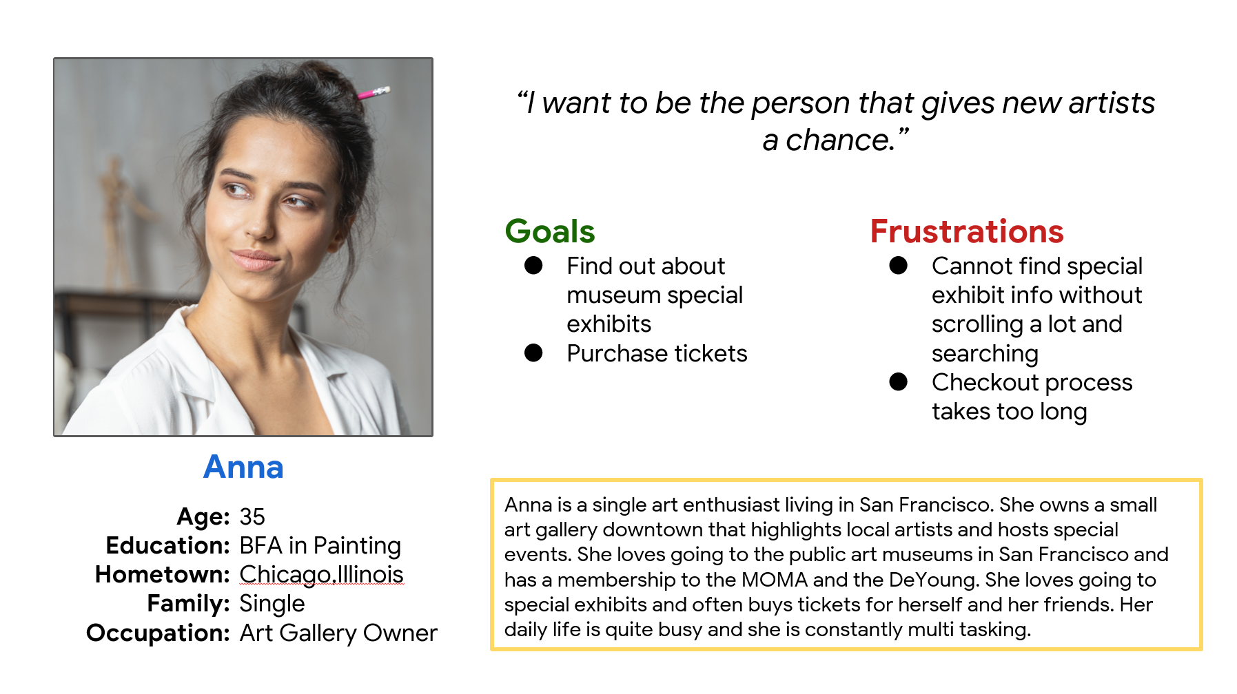
The demographic: The app's demographic is users between 24 and 65 years old, who visit art museums at least once a month. I developed personas based on user interviews with people who fall within this demographic such as the one for Anna, pictured here.
User research summary: I had initially assumed that users would want to find museum hours, location, and where to buy tickets as their primary goals. After interviewing real users I also uncovered other goals and pain points. Many users were interested primarily in finding out about special exhibitions at the museum. Some others felt that checking out was difficult and had too many steps. Finally some expressed lack of accessibility which made them not want to use these apps.
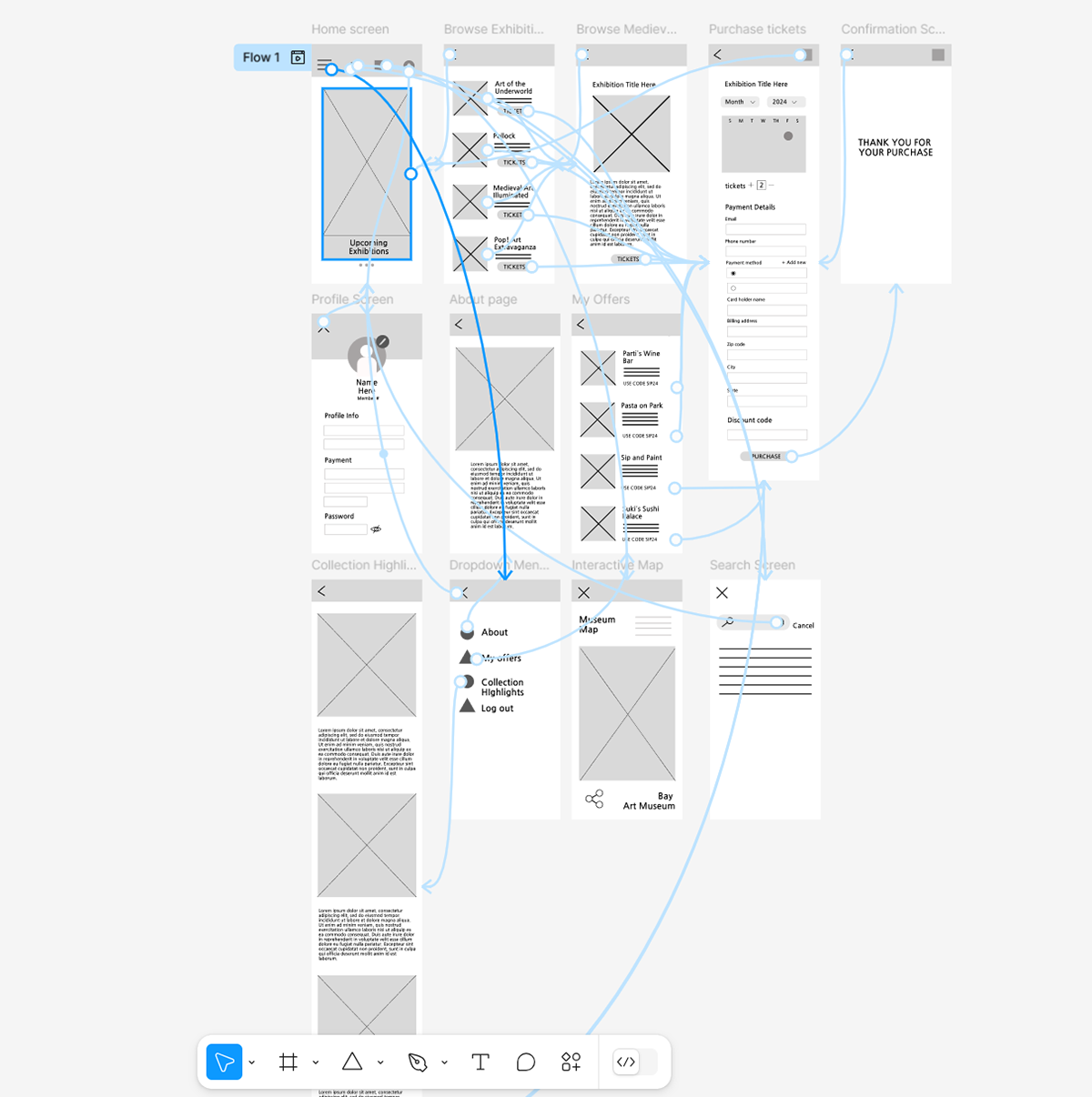
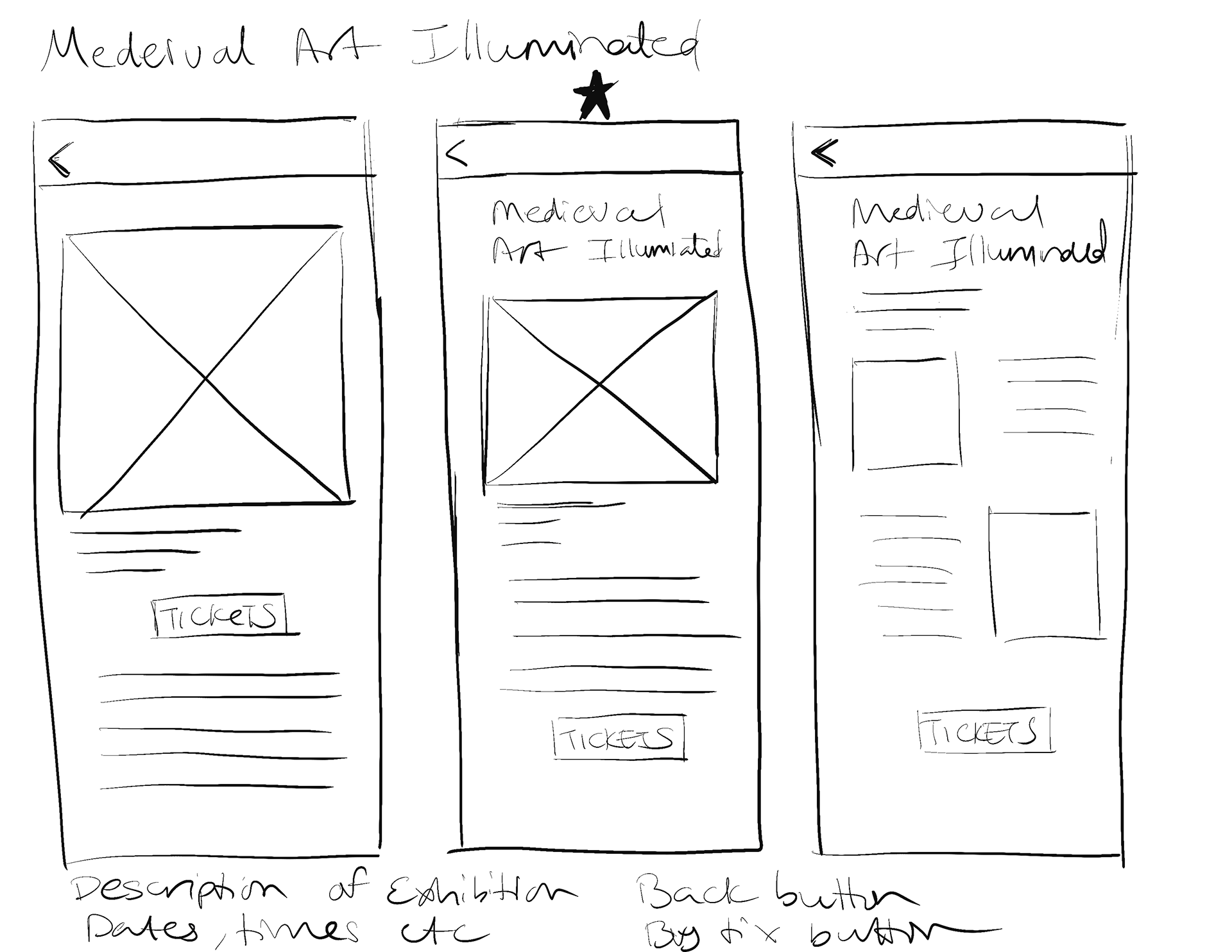
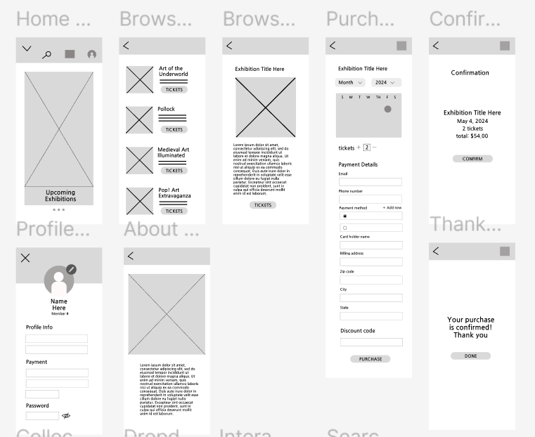
Design strategy: I focused on designing the user flow of browsing the special exhibitions and purchasing tickets primarily. My strategy was to make the checkout process simple and intuitive and make the special exhibit pages accessible from the home screen. I also worked on the profile area where the user can store credit card details so that their checkout purchases are even quicker.
User testing results: After conducting a moderated usability study, I learned several things. 4 our of 4 participants in the study wanted a confirmation page added in between the checkout and the thank you for your purchase screens because they found it jarring otherwise. 3 out of 5 participants in the study liked the design of the profile page but couldn't find it from the homepage. Finally, 5 out of 5 participants were easily able to return home once they had completed their ticket purchase.

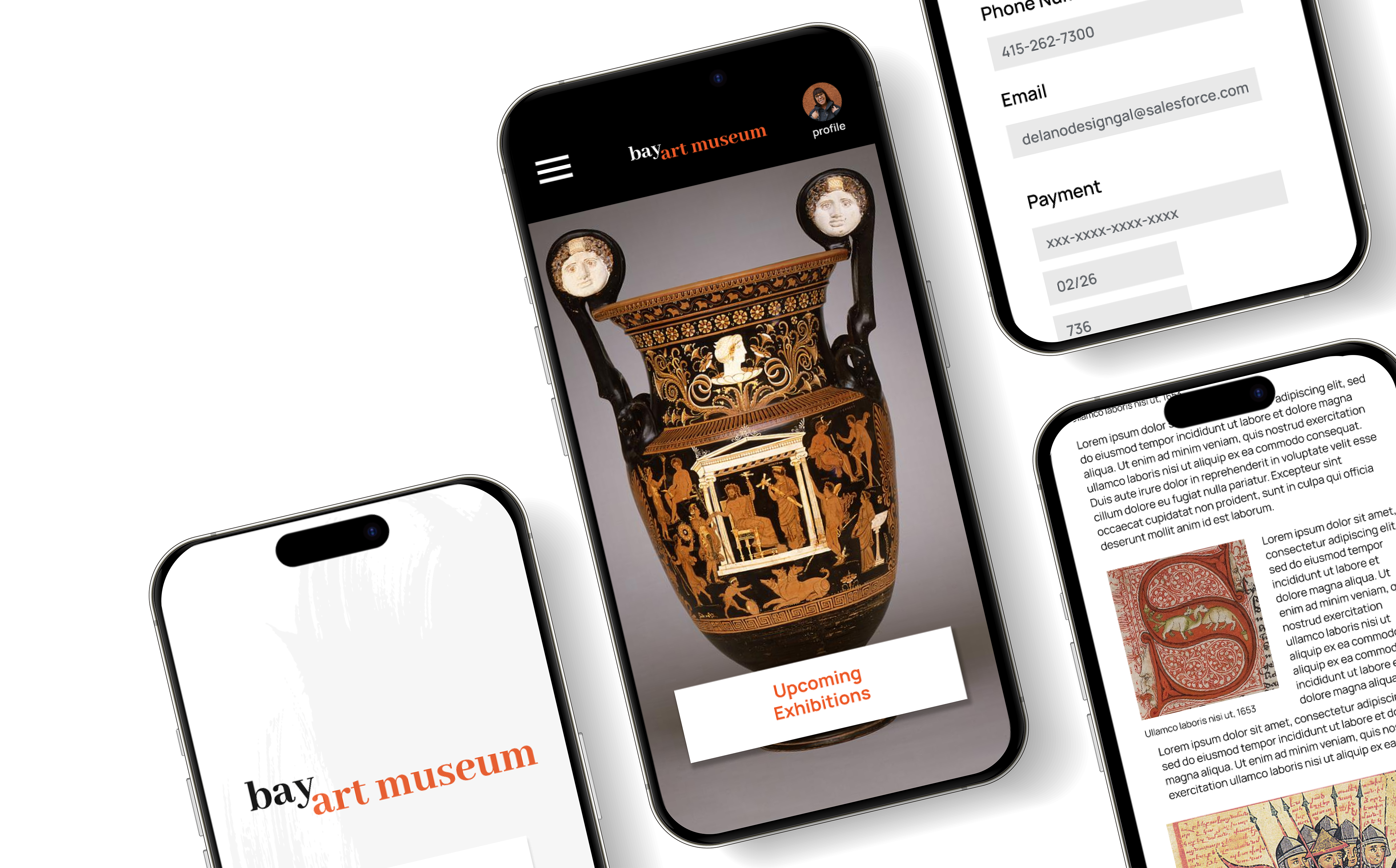
Final designs: I iterated using feedback from the moderated study and created the high fidelity mockups and prototype.
Takeaways:
Next Steps: